Thursday, November 18, 2010

Mid-Term Project

INDUSTRY: Art & Culture - Opera

AUDIENCE: Teens/Young Adults ages 13 - 18.

FORM: Print Design - Poster


Research:

Collect images & info to fit the project:

1. Old Opera: the Magic Flute

2. Us: Talent show revival: Jackie Evancho

3. Britain: Talent show revival: Paul Potts

4. Canada: Modern Stories: Lillian Ailling

1. Old opera: Magic Flute - originally by Mozart - made into
a modern Ballad


The designer and how they have used the colours?

The combination of blue and black blending in with one another help to make the black less dominant and more complimentary to the shades of blue. This also helps to define the other illustrative elements within the composition such as the moon, pigeon, and toucan and the boy with the magic flute. The background colours and shapes also help to create a sense of mysticism, fantasy, leading you into a magical journey. The heavier black shadows around the boy and pigeon create a sense of depth and harmony within the composition. The use of white on the pigeon, pale flesh tones and highlights create the feeling of purity and innocence and make the overall poster more dramatic and appealing. The purple clothing complements the other colours in the image well, and seems to aspire the viewer more towards the activity of the flute and the type of music being played, as the purple communicates calmness and imagination... much like the Pied Piper of Hamlin.

4. Canada: Modern Stories: Lillian Ailling


The designer and how they have used the colours?

Again we have a good strong use of white on black as a solid graphic. The smaller illustration on the left is instantly sent behind the dominant black but is complemented by the subtle use of cyan's/greens, blues/greys and yellows/oranges ALL working in harmony, with the blue giving a feeling of journey and coldness. Yellow and orange give off warmth and determination within the character. The designer has taken a classic rule of unify the type with the image by picking out the cyan for the 'world premiere and running dates' to stand out from the black background. The nice use of the subtle violet for the 'daring journey, dark secrets', gives off a sense of adventure and quest that hasn't been accomplished before. The use of bold white for the heading balances the whole dynamics of the layout and composition perfectly.


Proposal:
Opera poster for a target audience (13 - 18 yrs)
To design the poster for the fictional book "The Giver" (1993) by Lois Lowry

Summary: The book is set in the future, in a time where there is no crime, disease, or pain, Jonas, a 12-year-old, is selected to become the next Receiver of Memories, where he learns that the Utopian world he's lived in may not be as perfect as he had thought. Lowry creates a biting emotional tale that cannot easily be forgotten in possibly the greatest work of futuristic fiction since the days of Orwell. Even though I haven't yet read the book, reading the plot summary gave me a real understanding of the content, and also helped me to start to visualise the book in terms of composition, colour, text and image.


Development work and Final realisation of opera poster, for the book "The Giver" by Lois Lowry.


Conclusion:
The final realisation of the poster design I am reasonably happy with. This project I struggled with and just tried too hard to find a solution to the problem. After seeing the opera poster for the Lillian Alling performance at a bus stop I thought, hey... that's the ticket. As with most design and illustration pieces I do there is all ways room to improve, but at some stage you have to let it go, so maybe being content is more appropriate. The poster has lots of impact with the hierarchy's of type functioning well in relation to the importance of the information. The choice of black for the type was also intended to give further impact to the viewer, and also reflect the dark, yet some what believable future the story conveys. I felt choosing to use hand rendered type for the title was appropriate for the nature of the story, where society is limited to the basic functions of life, with technology only playing a minimal role. This is very similar to references made in the book "1984". The main character "Jona" is illustrated on the poster in a layered affect of colours rendered in marker pens, with primary colours breaking through subtly. This is because he is one of the chosen few who can see colour. The block patterned eyes show this with a yellow dropped in the middle as an indicator of hope. The grey helps to neutralise the black and push the yellow out, also encouraged by the heavy black frame. I was going to go for a simple white background but felt in term's of the posters commercial value and its young audience, colour seemed an appropriate solution. I chose a warm calming colour (light purple/violet) to help attract the viewer, plus balance the abstracted dark sinister nature of the image Jona.


Tuesday, October 26, 2010

Journal Excercise 5

Brief - Part A: Explore colour in relation to its anti-authoritarian potential. Show how a conscious application of colour to a traditionally "chromophobic" environment , object or image can alter the "conservative" nature of the content.

Image 1

This image represents a proud Asian man in his chef outfit. He is standing to attention, and has earned the respect and privilege of being a full ranking chef. The white represents (purity, cleanliness, perfection, truth, simplicity).


My idea: when I first saw this image I instantly thought of an authoritarian figure, and the military, that could also be for a regime fighting for territory, religion etc… or as a protector of the public more represented by the government. So I placed a military camouflage over the white with conflicting meanings, (neg: greed, poison, corrosion, inexperience) / (pos: healing, harmony, success, honesty, youth), and also dropped in a bright red dot. This to me represents blood, war, regimes, dictatorships e.g., Japan world war 2, Viet Com, and the invasion of Nan kin China, to expand in territory.


Image 2
Damian Hirst - spot art
Initial inspiration for using dots in a doctors waiting room


This environment is set in a doctors waiting room. Some people may just have the flu, their child maybe I'll and are stressed with having to take a day off work. Some patients may also have more long term illnesses. Ether way nobody likes to be I'll, or at the doctors for that matter. The waiting rooms walls are generally white (cleanliness, simplicity, purity) /or they are a soft tone of blue (health care, sky, sea, peace).


My idea: was to use dotes as a symbolic representation of illness, that is used in medical diagrams e.g., cells, and also in animations e.g., the spotty purple tongue on a dog. I generally think dotes displayed in a doctors waiting room would communicate an illness of some sort. Could have the negative affect of patients worrying more about what they have /or what they could have. The circles alone could not do this alone. So much like the tube patterned seating in the London Underground to create interest, I have placed 8 different coloured circles on the back of chairs where people are sitting. I have also place 6 circles on the bin for those patients sitting in the front, and also on the doctors entrance door.

EFFECTS
1. people now have some thing of interest to look at
2. The colours are conflicting physically, emotionally and mentally. This could maybe give people more focus, or with the blue dote (top left) bring out coldness, depression etc..

I think this would be an interesting experiment to see how people are affected by the dots. I would also try various colours in different combinations e.g., Black and blue / or a single repeat of colour e.g., blue (feeling blue), black (death), grey tones (cloudiness, uncertainty, moodiness).

Image 3

This image was interesting and controversial in the sense that you have 2 iconic people (Fidel Castro & the Pope John Paul II) shaking hands.


My idea: The black suite of the aging frail Castro represents (pos: power, authority, sophistication, seriousness, mystery, dignity, solitude) and (neg: fear, evil, secrecy, emptiness). Then you have the pope wearing a bright vibrant green shroud, that represents, (pos: fertility, growth, healing, success, nature, harmony, honesty, youth - the money is a controversial one, based on how rich the Vatican, and ways the Vatican invests its money and generates money. This could also tie in with the neg side of green which could be greed and poison. Religion causes so many problems in the world, with the third world no exception. The idea was to create more controversy in with Castro standing in all his glory in a green jacket. This would be him trying to represent himself more towards god and the church. Using this most momentous opportunity to advertise this shaking hands with the pope. Also green to give off conflicting messages, such as Castro projected as a villain, selfish and greedy/ or being colour blind.. maybe?

Part B
Brief: Take a example of a conventional "colour" subject matter and alter the image, object or environment into one vacated of an overt use of colour.

Candy Intervention:
My object(s) are coloured green sweets in a brown paper bag. My idea was to take out all the coloured candy and only keep the green ones. Based on my past memories and reflections as a child I remember never really wanting the green candy, and also offering candy to friends at school, that again generally only wanted the reds and oranges, and anything else but the greens. I decided to do a small intervention that consisted of offering green candy to members of the class to see how they react, and to then gain some written responses.

Responses:
1. Green candy... first thought: SUGAR!!
2. Green not my favourite - didn't have one sorry vegan
3. I'm hungry, will eat any colour
4. Ate 2 but I'd rather have the red ones
5. Green means go! sugar gets people to go!
6. Yummy jelly bellies - limey
7. Green maybe associated w/ healthier foods which maybe why children are less prone to choose it amongst multi-coloured candy
8. Green sweets: sugar and chemicals


Feedback: This didn't turn out how I expected with a lot of people taking the green candy when offered it. But based on the written responses I still feel having more colours in the bag would have swayed more of the groups decisions. I would like to continue this intervention further in the future...

Written component: 3 examples of how specific applications of colour attempted to create a sense of "fantasy", "otherness" or "consumer spectacle" in the design around you.


Image 1
This image I came across on my visit to the cemetary during my first journal excercise. Seeing the silouetted elephant and camel on a piece of signage was a surprise to me and very comical, especially at a place where people are buried. That in itself is a strange concept for me to comprehend, so communicating humour could well be an appropriate choice! Think having a life like model of an elephant and camel situated some where in the cemetary is well worth having. Or to make things more subtle, why not just some elephant footprints embedded into the path.


Image 2
This was one of many images I took during my research for my yellow presentation. Its a playground near 38th Main, where people leave toys for children to play with. I felt that there was a fantasy element to the space that was created by the sense of the variations in scale. The construction truck in the foreground is also complimenting other elements of the space with the colour yellow.


Image 3
After finishing my first session on the programme at Langara and walking along 49th to my car,
I came across a street post with balloons attached to it from the bottom, that must have slipped down. It was obvious that this was to celebrate the new semester, but if you didn't know the college/ or the college didn't exist it could conjure up a fantasy dream like state, especially after a few beers. I took the picture with my flash on, which helped to catch a nice glow around the sign, and enhance the image into a more magical spectical. The same image below was just an idea I had of manipulating it slightly by adding white glowing lights that could represent fire flies/ or even fairy's attracted to the glowing sign.


1. Commercial Drive Library: this is a place I go to on a regular basis. It is one of the older libraries, so it is a bit run down. E.g., only 3 of the power outlets actually work. Every thing is clean and regimented, and the use of colour is minimal. The floors are a grey patterned tone of carpet, and some of the tables are too (neutrality). The walls are a cream off white (simplicity). Book selves are a light Brown yellow where colour has again been considered as a neutral. There is an attempt to liven the atmosphere up, with the use of hanging hand painted children's banners (bright primaries & complimentary) from the ceiling above the divide of the library.

Journal Excercise 4

Brief: Locate an existing piece of communication design. Analyze and deconstruct how the use of colour and contrast focus the viewers attention. Based on your observations create a 3D representation of your image.

Below: Original ad for Santafebrewing


Primary: red, yellow and orange are ALL warm colours

* The initial focal point of the design is the red symbol on the bottle top that is an aggressive tone of deep red that your eyes are drawn to.

* The vibrant yellow bottle top is the second thing you focus on, with the use of the contrast in the orange and brown shadow.

* The fact that the yellow is within a circle also makes the colour stronger.

* This is also helped with the yellow/brown darker shadow running around the bottle top, that fades as the light source hits it from the top right hand corner.

* The depth of the background is created by a mix of yellow and orange gradient of colour, that is a darker shade around the edges and gets lighter as it gets closer to the bottle top.

* The backgrounds soft mix of yellow/orange help to give the illusion that the bottle top is coming out at you.

* You then view the other elements in the composition (text: brighter shade of red)
with the colour branching out to direct you to the shade of red - NW, NE, SE and then the caption that is also set in the same tone.

* The orange arrows that help to give the impression of a compass, are also tonally deeper in orange to stand out, but secondary to the red type.

* The web address below is the last piece of information you look at, set in the same tone of red and orange as the above.

Jason— your selection of the beer ad for this exercise showed a clear understanding of how colour, shading and contrast work together to give the illusion of dimension. To further link your selected ad to your 3D recreation, experimentation with other materials (metallic surfaces etc) could have emphasized the contrast between the faded background and the cap. Using found objects like actual maps or bottle caps may have helped to clarify some of your design decisions. Your written analysis of the work shows a clear understanding of the relationship between colour and form. Overall, good work.

Journal Excercise 3

Brief: Locate an example of contemporary graphic design (web page, print advertising etc) that utilises a strong approach to colour (IE: colour is important to its general structure/design).

Produce a series of visual alterations upon your source image.

1. altering the colour scheme
2. altering the intensity
3. altering the colour temperature

Examples below: show how altering the intensity of existing colour(s) can influence the messages the image intended to communicate. (work in progress)

Australian Post – If you really want to touch someone, send them a letter.


In this example I focused on the girl’s skin. Even though she has a subtle smile, her skin is an ice cold blue, which for me represents lack of/ or no emotion at all. Her facial expression also comes across more uncomfortable, with an obligation to embrace the seemingly male figure. The red strip below represents anger instead of just a Postal brand. This ad could now represent some thing for Aids (HIV) giving of the feeling of Isolation, and even abuse towards women.


This example shows the background as an intense transparent purple/violet, with the strip below as a solid purple. For me this colour gives off a sense of calmness and trust that is met with pure embrace. This ad could now represent some thing for a charity, health care, yoga/meditation studio, dating agency, or even to raise awareness towards some form of religion or spirituality.


In combination the colours don’t work well together, as they give off conflicting messages.

Monday, October 25, 2010

Yellow Presentaion


I have selected parts of my presentation that I felt were very interesting, and would like to research further in the future. Also included is my analysis of 3 examples that take a conscious and creative approach to the application of my assigned colour... yellow.

Yellow traditionally represents the sun and is a most cheerful colour when used in moderation. If used too liberally, it can tire the eyes and make people irritable.

Fact: Couples with yellow kitchens tend to argue more often when in those areas. Yellow is also known to represent GREED and COWARDLINESS. During 10th century France, the doors of traitors were painted yellow.

Emotional
 Positive: Optimism, confidence, self-esteem, extra version, emotional strength, friendliness, creativity. 
Negative: Irrationality, fear, emotional fragility, depression, anxiety, suicide.

The yellow wavelength is relatively long and essentially stimulating. 
In this case the stimulus is emotional, therefore yellow is the strongest colour, psychologically. The right yellow will lift our spirits and our self-esteem; it is the colour of confidence and optimism. Too much of it, or the wrong tone in relation to the other tones in a colour scheme, can cause self-esteem to plummet, giving rise to fear and anxiety.


Print Design: Example 1
The Swiss group Yello (album covers). Started in 1979 and are still going strong. Hard to explain the style of music… but consists of lots of instrument and voice sampling and electronic sounds that are some times mixed with traditional instruments.

Based on the information I sourced the record sleeve came out around the early to mid-eighties.


* Why is the designer choosing to use this colour?
Several different reasons I think the designer(s) choice of the colour could have been that the colour was trendy/fashionable at the time, and also the richness of the yellow gives the text impact, with the fine white lines creating a more interesting composition, directing the viewer around the hierarchy of text. The obvious reason is that the colour was used in relation to the bands name (Yello) that is spelt without the ‘O’. With the use of the word play and a strong graphic yellow, this would help to market their brand identity as well as their music to entice new music fans across the globe.


* How would it be different in another colour?
Dropping in a replacement colour would be interesting, but would draw the viewer away initially from the word Yello (maybe), and the white and black text may have to be changed. The design and composition may also have to be rearranged, and this could also have a knock on affect to the choice of font(s). This would all depend on the replacement colour.

* How does this colour choice affect the viewer/consumer?
The colour affects the viewer by giving the cover a strong presence also giving the false impression of an important piece of signage that needs to be read. With the simplicity of the design and content the viewer can easily process the colours and the information. The use of white is a good balance with the yellow helping the text to jump out. The yellow also helps to express the bands unique style of music.


Print Design: Example 2

Rethink design agency: Playland's 2010 campaign is based on the insight that screaming is cathartic. There are plenty of things in life that make you want to scream, and there’s no better place to let it out than on the rides at Playland.

Definition - Cathartic: providing psychological relief through the open expression of strong emotions; causing catharsis : crying is a cathartic release.


(My first impression)
My first sighting of these ads was one of awkwardness with a touch of disturbance.

* Why is the designer choosing to use this colour?
The use of this particular yellow shouts out, again like a piece of signage giving of a loaded / loud message. It pushes out the black silhouette crying out with the blow horn embed in the back of his /or hers throat. It works well with the use of black and white, with the whole design brought together with the energy and vibrancy of the yellow.

below: 2 examples from the same advertising campaign.


* How would it be different in another colour?

My first impressions are that they are both strong and uniformed in their design. The green example is vibrant and stands out, giving off an emotional response of aggression and toxic waste. This is partly due to the choice of imagery e.g., a baseball cape, and sharpness of the object inside his mouth, in combination with the vibrant green coloured background. The vibrant pink example could be seen as a cliche used in conjunction with the silhouetted image of a girl with her hair tied back. However I think the pink is an obvious choice, yet effective in its execution, with the background colour helping to define and communicate the image, keeping the text legible. 


* How does this colour choice affect the viewer/consumer?
Yellow image: The colour is visually strong and very neutral, giving of a sense of discovery, danger and fun, being a colour used a lot for children’s products e.g., toys, pens, cloths, clowns, teddies etc... So there is an element of nostalgia there, with the use of secondary imagery giving of a sense of fun and play for all age groups, especially those with young and teenage children.


Music Video: Example 3


Cold play official music video - YELLOW

www.youtube.com/watch?v=CAME8GDRTfI


*Why is the designer choosing to use this colour?

*How does this colour choice affect the viewer/consumer?
Yellow is associated with nature, and the sun, so using a beach setting that is nearing a sunrise seems very appropriate. Subtleties of yellow tints start to intensify around the whole image and are not obvious straight away, but become more obvious when the camera pans round to the beach. The title of the song ‘Yellow’ and the power of the lyrics help to unite the whole concept of the video giving it meaning and true purpose. The video is also slowed down, that again helps to associate you with the calming colour of yellow. The singer ‘Chris martin’ expresses the song with perfect movement and melody, with a true sense of understanding, love and compassion.

Song Lyrics - Yellow


The whole experience leaves me with a more clear and positive attitude, with the simple message of... enjoy life to the full.

Journal Excercise 2

Brief: Choose from one of the following thematic choices:

1. Light in relation to the supernatural
2. Light and scientific discovery
3. Light as the abstract form


These images where a spontaneous reaction to light and colour in relation to the supernatural. It was one of the first heaviest rain falls in September since the end of the summer, and being out in the rain taking these pictures was an interesting experiment with the reflective light from the street lamp, and the movement and contact of the heavy rainfall. The yellows and oranges are a good intensive colour combination that you could perceive as a form of energy and unknown life force. I took many shots and decided to select a handful that I felt showed a progression of movement and colour intensity. My old digital camera also lived to see another day...


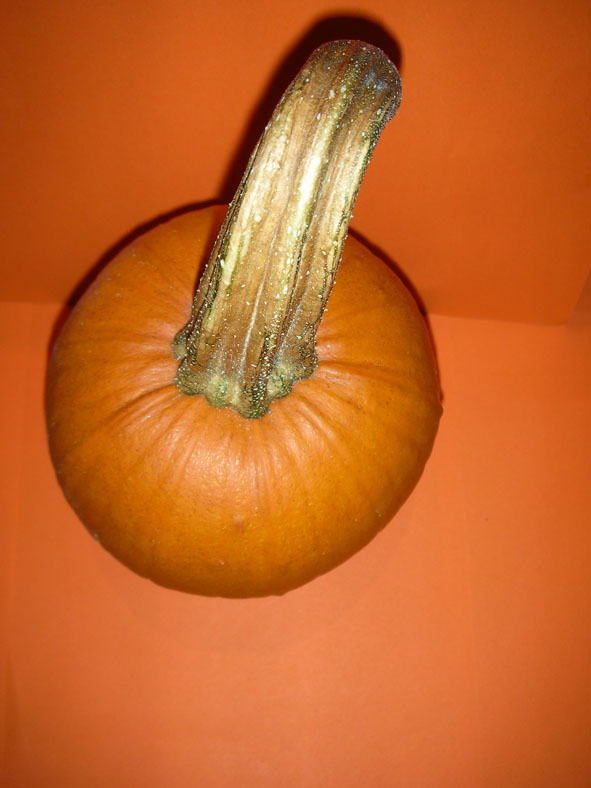
1. Pumpkin Series: All images captured in the dark using a flash, small spot light and orange card. I initially started to experiment with a pumpkin (that I grew), then aluminium foil, that is very reflective and plastic transparent bubble wrap.

Taken directly over top with a flash.

Taken directly over top with a flash.

Similar shot as above, with foil covered in bubble wrap.

Image created with orange card, pumpkin and foil.

Orange card and foil with a flash and a small spot light,
with pumpkin in the foreground.

Close ups of pumpkin wrapped in bubble wrap.


Started to experiment with foil and coloured card.

Same as above, but with rolled up tubes of orange card.

Changing the surface colours.

A spontaneous shot taken with the camera through the
inside/ outside openings of the bubble wrap, with the foil
reflecting light in the background.

Under a table with the laptop in lots of shadow, taking
a shot directly of the foil - reflecting the light from
the Mac's Visualizer.

Last two shots taken directly onto the Mac's Visualizer,
with a flash.. still under a table.


Feedback & Reflection: The pieces where well received amongst the group, with praise for my experimentation that showed fluidity in the development of ideas and use of every day materials. The pumpkin series was generally considered the more interesting of the bunch, with the use of organic and man made materials. My understanding of the camera and lighting is very limited.. and can be a bit hit and miss, but I felt that the process was a real learning curve, and opened my eyes more to how I perceive colour, light and shadow.

Re: Exercise #2 (light)
Outstanding work. Excellent demonstration of innovative use of a range of materials and lighting. It is interesting how my perception of these change when viewing them on screen, particularly the ones with the bubble wrap - they seem even more mysterious to me. Either the one labeled "Camera partly obscured by bubble wrap with foil in background" was much less dynamic in print or I just don't remember it very well, because I am really intrigued with its sense of depth now. Your narrative writing for the written component was very good as well.